Ad Code
Translate
List of 6,000+ Dofollow Commentluv Blogs FREE (Updated 2025)
January 16, 2025
What is Ozempic (semaglutide)? (Updated in 2025)
January 30, 2025
How To Find Suitable Properties In Cyprus? (Updated in 2025)
January 11, 2025
Smart strategies for trading on crypto exchanges
February 18, 2025
What should be on the footer of a website?
Khabza Mkhize
February 12, 2024

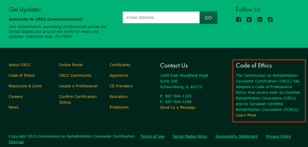
Website footers are a very important cross-cutting building block at the bottom of your pages. In this article, we will provide quality website footer examples. This element is mainly used as a block of additional information and linking. Less commonly, you may come across footer ideas as an auxiliary lead collection tool. The content depends on the type of business and the goals of the site. Sometimes a project involves different types of footer content for different pages of the same site. Before making a choice, we recommend that you explore as many different footer design examples as possible.
What to post in the footer?
Best website footers contain important information for visitors. A good solution would be to indicate information that needs to be easily found on any page, so the content of the header may be partially duplicated there. The specific dataset depends on:
- Site type;
- Topics;
- Design;
- Contents of other blocks.
Authorship Information
The footer of the site traditionally indicates the copyright, terms of use and distribution of content, information about the developer of the resource.Information about partners
You can write who supports the project or list the company's partners. This can work to increase the level of trust, be a convenient solution if affiliate links are placed under an agreement on each page of the site. Your own child projects, social media, and links to mobile apps will do.
Duplicate contacts
In the header, only the phone number is usually indicated, and everything is detailed on the contact page. A middle variant is often created in the footer of a website:
- Address;
- Phone;
- Email.
Social media
Buttons for groups in social networks or widgets, where you can see the number of participants, are logically adjacent to the contact block. They are often placed or duplicated if they are already in the header or side blocks.Feedback
Adding the ability to directly contact or leave your contacts in the footer improves the user experience. Also, site owners can collect a database of interested visitors. Work well:
- Callback order form;
- Subscription to the newsletter;
- Adding a product to the cart (if we are talking about an online store).
Google Map
Placing an interactive map in the footer increases the convenience for users if the exact position of the company is important to them (for example, they are looking for something near the house). It can also help build trust by confirming that the firm exists outside of the Internet.Privacy Policy and Personal Data Protection
If registration is provided for on the resource or information that falls under the definition of personal data is collected in some way, it is necessary to post the relevant legal documents on it:
• Use of Cookies;
• Terms of use;
• Privacy policy.
Age limit
If the site requires an indication of the age of users for the materials, this is often published in the footer.Other information
You can write registration information in the footer. You can indicate that the resource is not a public offer. Information about the presence of contraindications is suitable. It is important to post here everything that is required by law to accompany publications in a particular subject.Site's map
A link to a sitemap with a clickable list of all materials in a hierarchy in the footer leads to an increase in leads.
Extra menu
You can fully or partially duplicate the main menu. More often, the most important or popular sections of the site are taken out. If there is a lot of information, it is divided into columns with explanatory headings.A "Top" button is added for the convenience of users so that they do not need to scroll back the page.
Counters
They are placed in an accessible form for viewing. This is more often in information projects, where the attractiveness of a site for advertising can be judged by traffic data.
Featured Post
12 Prominent new technologies and trends emerging in 2025
Khabza Mkhize-
April 02, 2025
Soapie Teasers
Sister Sites
Most Popular
List of 6,000+ Dofollow Commentluv Blogs FREE (Updated 2025)
January 16, 2025
Smart strategies for trading on crypto exchanges
February 18, 2025
Popular posts
List of 6,000+ Dofollow Commentluv Blogs FREE (Updated 2025)
January 16, 2025
Smart strategies for trading on crypto exchanges
February 18, 2025
Footer Menu Widget
Created By Blogspot Theme | Distributed By Gooyaabi Templates

0 Comments